
Content review for data as a service (DaaS) design
In this post, we take a look at a the landing page for a data as a service (DaaS) platform (https://www.vibe-data.com). The design overall is solid and appropriate for a landing page, but there are two areas that can use improvement.
Chart labelling
The first opportunity for improvement is in chart labelling. The labels can be improved in two ways.
- Remove overlap In some situations, the chart labels overlap, typically the labels for the axes. This makes the labels difficult to understand at a glance and also difficult to read.

- Simplify text In general, the axes label text is verbose and repetitive. This can contribute to the overlap as the browser struggles to render the text within the constraints of the chart area.
If we can adapt the language used in the labels slightly, we can likely improve not only the overlap issue, but also readability and scanability.
 For the X axis, we propose changing the text from:
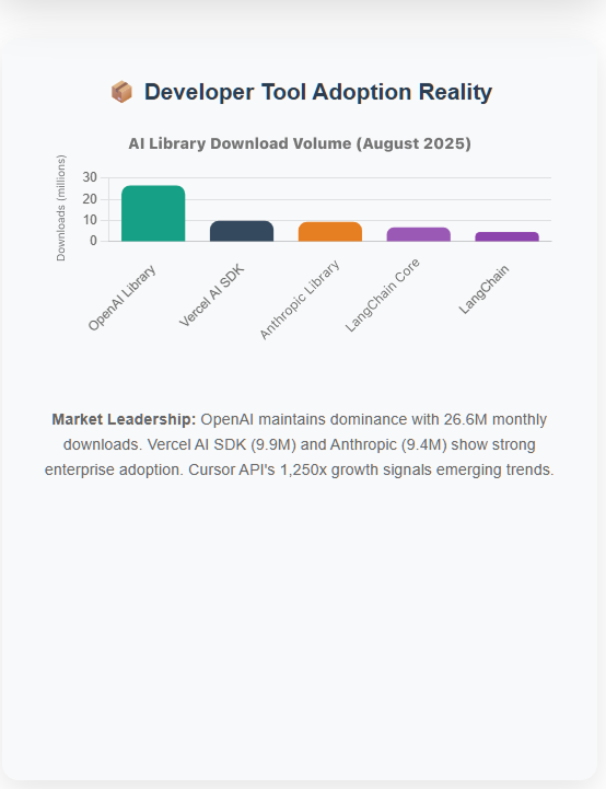
Monthly Downloads (Millions)
to:
Downloads (millions)
This small change improves readability and scanability because the period of the chart is already established in the title (August 2025), making “monthly” redundant. For the Y axis, to avoid the overlap issue, we propose removing the axis label. The current label (“AI Development Libraries”) duplicates information that is already in the title of the chart. We also recommend changing the chart title text from:
AI NPM Library Download Volume (August 2025)
to:
AI Library Download Volume (August 2025)
NPM is an acronym for Node Package Manager, a type of JavaScript library used for software development. Based on audience research, this level of detail is too great for this UX. It doesn’t provide any necessary information and isn’t used or defined anywhere else in the page. The title without it conveys the same information to the audience without introducing an unnecessary new term.
Accessibility
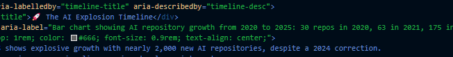
The second opportunity for improvement is in accessibility. This page is heavy with charts and tables. The information conveyed by or contained in them is crucial to understand the page. However, the current implementation is missing ARIA labels throughout, but most importantly, for charts.
 We recommend including ARIA labels for all charts. The labels should clearly provide the same information as in the chart. This is important so the charts can be understood by audience members using assistive technology.
 Descriptive
 aria-label text including the chart title as well as a textual description of the data represented by the chart should be added to the code for each chart.
Resources
The chart recommendations can be found in Figma. Note: Screen captures are used throughout this post as the original design files were not accessible.